John Snow Research Project
Thomas Coleman
Harris School of Public Policy, University of Chicago
tscoleman@uchicago.edu
Papers
Full Snow working paper: https://papers.ssrn.com/abstract=3262234
github repository (data & code): https://github.com/tscoleman/SnowCholera
Causality in the Time of Cholera: John Snow and the Process of Scientific Inquiry, winter 2022. Slides presented at University of Chicago CEHD Lifecycle Working Group. Slides presented at University of Chicago KLab.
John Snow, Cholera, and South London Reconsidered: paper December 2020 (hosted SSRN) Presentation October 2020 (University of Chicago Spatial Study Group)
Presentation February 2020 (University of Chicago & City of Chicago): Slides or more detailed notes
Working paper examining Snow's South London analysis from both historical and modern perspective (hosted at SSRN): John Snow, Cholera, and South London Reconsidered
Discussing Koch & Denike's 2006 paper in Social Science and Medicine (hosted at SSRN): A Note on 'Rethinking John Snow’s South London study: A Bayesian evaluation and recalculation'
Introduction
I am not the first, nor will I be the last to fall under the spell of John Snow.
The story of John Snow's 1855 treatise On the mode of communication of cholera is a rollicking good tale - full of heroism, death, and statistics. But more fundamentally Snow's work is a sustained effort to convince skeptics, through argument and a wide variety of evidence, of the waterborne theory of cholera articulated in the 1849 essay of the same name. Snow's data and analysis provide a template for how to convincingly demonstrate a causal effect, a template as applicable today as in 1855. I consider two of strands of Snow's evidence - the Broad Street outbreak and the south London "Grand Experiment" - as pedagogical examples of using non-experimental data to support a causal effect. In doing so I discuss extensions to Snow's analysis using modern techniques and tools: most importantly difference-in-differences regression and count (Poisson) regression for error analysis in quasi-randomized control experiments. These provide clear and compelling examples of the modern techniques and tools, while confirming and strengthening Snow's original conclusion on the causal effect of water supply on cholera mortality.
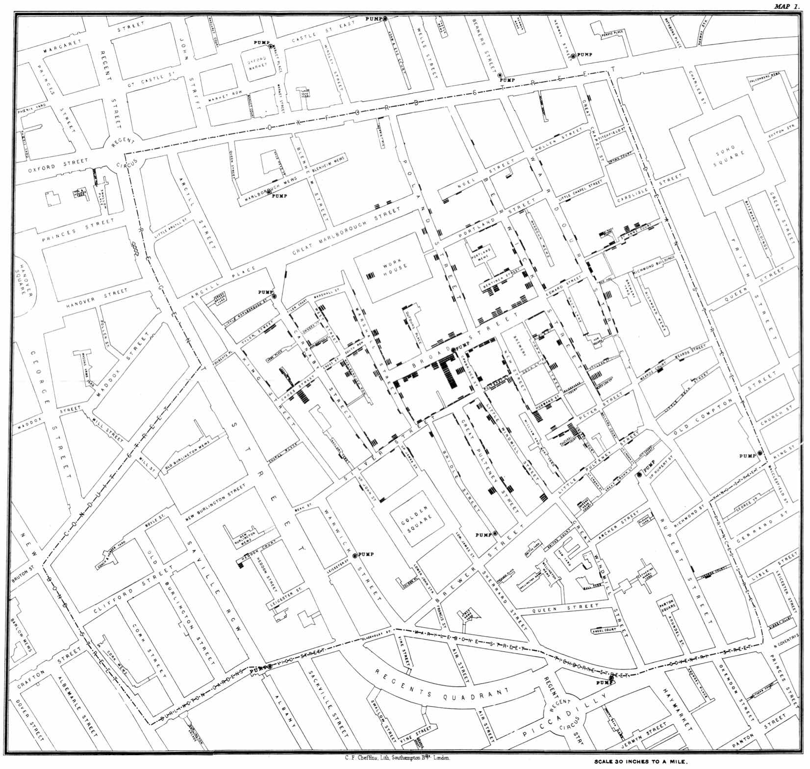
Snow's contributions to mapping and spatial analysis are justly famous and rightly celebrated - he is considered the father of modern GIS spatial analysis. Just below I provide some references and links to the mapping of the Broad Street outbreak - a very incomplete bibliography.
My primary goal, however, is to highlight Snow's examination of the South London districts, an analysis that is somewhat less well-known. Snow realized that the population of roughly 450,000 individuals living just south of the Thames in the districts around Battersea and Southwark provided a close-to-ideal experiment for comparing clean versus dirty water. Snow provided the first example of what we now call difference-in-differences statistical design, and his comparison between water suppliers is a prototype for quasi-randomized experiments.
My goals for this project are four-fold:
- Make Snow's data widely available
- Provide R Notebooks for the analysis of Snow's data using modern statistical tools and techniques.
- Discuss Snow's analysis and the modern extensions. Snow's data and analysis provide excellent examples for understanding and teaching current statistical tools and techniques, such as differences-in-differences and count (Poisson) regression.
- Argue that Snow's approach to demonstrating the causal effect of water in the transmission of cholera provides an excellent prototype or template for modern social science researchers.
For an introduction to Snow's work, see:
Snow's original 1855 monograph (it is masterful): Snow, John. 1855. On the Mode of Communication of Cholera. 2nd ed. London: John Churchill. http://archive.org/details/b28985266.
The best popular exposition I have found: Johnson, Steven. 2007. The Ghost Map: The Story of London's Most Terrifying Epidemic--and How It Changed Science, Cities, and the Modern World. Reprint edition. New York: Riverhead Books.
Another good popular version: Hempel, Sandra. 2007. The Strange Case of the Broad Street Pump: John Snow and the Mystery of Cholera. First edition. Berkeley: University of California Press.
Tufte's classic discussion of Snow's mapping (a topic I don't cover in detail here): Tufte, Edward R. 1997. Visual Explanations: Images and Quantities, Evidence and Narrative. 1st edition. Graphics Press.
Biography: Vinten-Johansen, Peter, Howard Brody, Nigel Paneth, Stephen Rachman, and Michael Russell Rip. 2003. Cholera, Chloroform and the Science of Medicine: A Life of John Snow. Oxford; New York: Oxford University Press. Linked on-line resources https://johnsnow.matrix.msu.edu/snowworks.php
Data for John Snow's South London "Grand Experiment"
I have posted a subset of John Snow's tables plus R notebooks for analyzing the data on github: https://github.com/tscoleman/SnowCholera I have also posted descriptions and explanations here
Explanation / List of Tables for Snow 1855 ("On the mode of communication of cholera") The highlighted tables are posted on GitHub
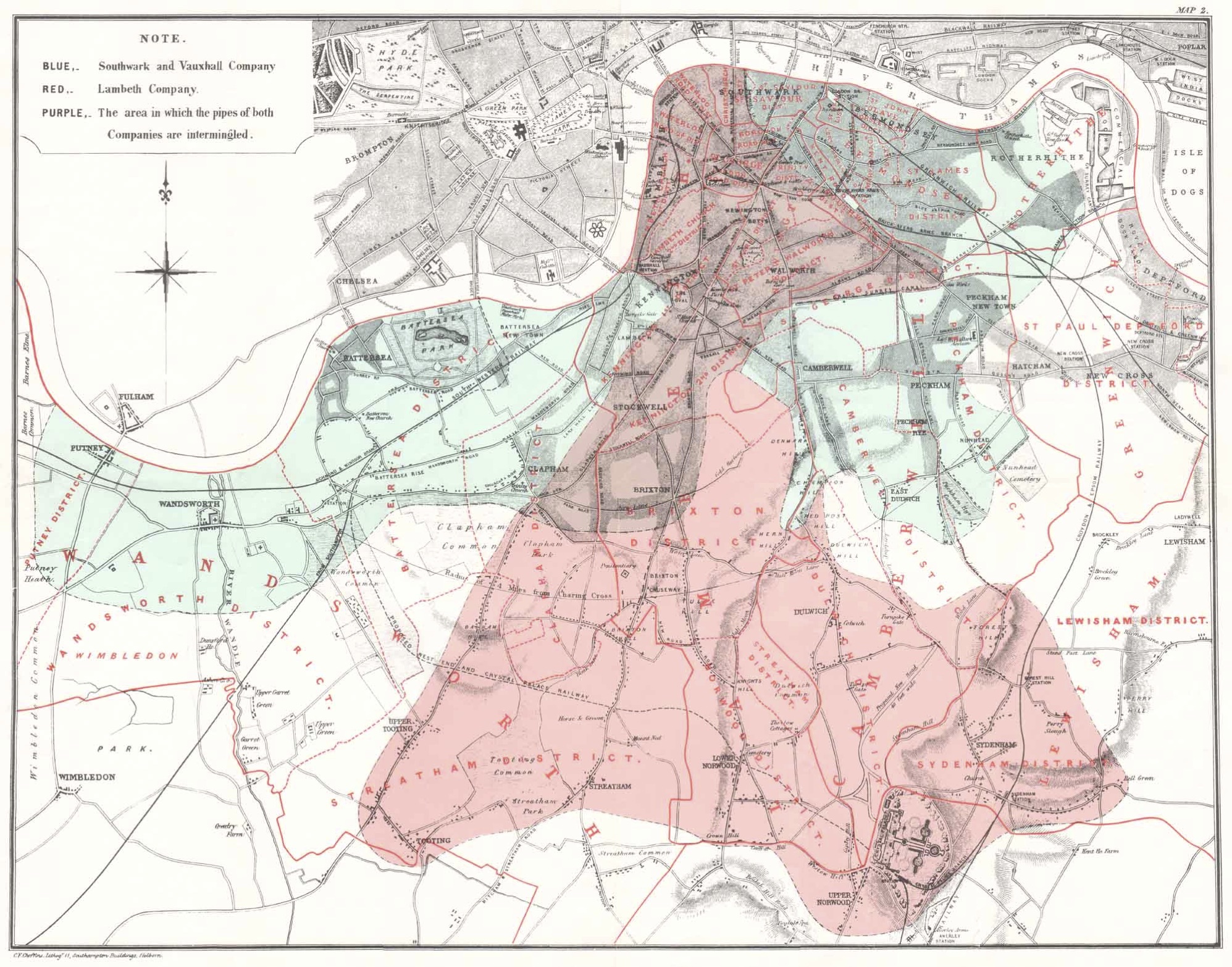 Table III: 1849, deaths by District. With "Annual value of House & Shop room to each person in £"
- Table V: 1853, deaths by District, 17wks Aug 21 - Dec 17, 1853
- Table VI p 73: 1853, deaths by Sub-District, August 1853 - January 1854
- Table VII: 1854 p 84: deaths by Sub-District, four weeks ending 5th August. Categorized by source (Southwark & Vauxhall; Lambeth; Pump-wells; River Thames, ditches, etc.; Unascertained) categorization carefully performed by Snow
- Table VIII p 85: deaths by Sub-District, seven weeks ending 26th August. Categorized by source (Southwark & Vauxhall; Lambeth; Pump-wells; River Thames, ditches, etc.; Unascertained) categorization carefully performed by Snow
- Table IX p. 86: The Southwark & Vauxhall vs Lambeth comparison (quasi-randomized trial). Displays number of houses, a summary of Table VIII (plus additional for "Rest of London"), and calculated mortality rates per household
- Table X p. 87: Deaths by week Sept 2 - October 14, for South London (aggregated), from Registrar-General. Categorization of water source but not as thoroughly done as by Snow for July & August.
- Table XI p. 88: 1854, population and death rates for all London and aggregate districts ("West", "North", ...) and for houses supplied by Southwark & Vauxhall vs Lambeth. (Rates to population, not to houses as for Table IX)
- Table XII p. 90: Deaths 1849 & 1854 by sub-district. For 1854 through October 21 (versus through August 26 for Table VIII) For 1854 through October 21 (cf p 89) "It is necessary to observe, however, that the supply of the Lambeth Company has been extended to Streatham, Norwood, and Sydenham, since 1849, in which year these places were not supplied by any water company."
Explanation / List of Tables for Snow 1856 ("Cholera and the water supply in the south district of London in 1854") The highlighted tables are posted on GitHub
- Tables I & II, pp 251-252: number of houses, population, density, houses & population by supplier, and deaths by supplier (water source) for the first seven weeks (ending 26th August 1854) reported by 32 sub-districts. Table I shows the data collected by Snow, Table II the data collected by Mr. Whiting. These data match Snow (1855) Table VIII. These data are high quality in the sense of very few deaths with "Water supply not ascertained"
- Table III, p 253: data from Tables I & II (seven weeks) aggregated to the Registration District level (11 Districts). These data are high quality in the sense of very few deaths with "Water supply not ascertained"
- Table IV, p 254: same format and data items as Table III, for the last 10 weeks of the epidemic (data collected by the General Register Office). These data are less high quality than Table III in the sense of many deaths with "Water supply not ascertained"
- Table V, p 255: Tables III and IV combined (i.e. the whole epidemic of 1854)
- Table VI, pp 256-257: Population, estimated population by supplier, deaths and mortality rate, and Snow's predicted deaths and mortality rate by sub-district.
R Notebooks for Analyzing the South London "Grand Experiment"
I have posted R notebooks for analyzing the Snow's South London data on github: https://github.com/tscoleman/SnowCholera I have also posted descriptions and explanations here
Please note that these are first drafts and are still rough form.
These notebooks are copyrighted and licensed under the BSD 2-clause license, which allows modification and distribution but requires inclusion of the copyright and license.
List of notebooks on github. For each there is an RStudio notebook with explanation and code. The notebook (.Rmd) can be run in RStudio. There is also an associated html sheet (.nb.html) which displays the results. The links below are to copies of the .nb.html that display the results.
Snow1855_read1- reads in data for Tables VII, VIII, IX, XII and runs some basic cross-checks,
- Simple Difference-in-Differences and Quasi-Randomized Comparison:
- calculates and explains a simple diff-in-diffs table comparing 1849 versus 1854 for the "first-12" and "next-16" sub-districts
- calculates Table IX (mortality rates by houses, simple quasi-randomized comparison - quasi-randomized control trial), and calculates imputed houses for Southwark versus Lambeth and mortality rates.
- Runs linear and count regressions for the comparison of 1849 versus 1854, using data from Snow 1855 (i.e. without sub-district population separately by supplied)
- Discusses in more detail the error process for count regressions for 1849 versus 1854
- The data exhibit more variability than consistent with Poisson counts - what is called in the literature "overdispersion"
- Graphs (using helper functions) the actual and predicted rates by sub-district, highlighting the variation ("overdispersion") both across and within sub-districts
- Reads in and does some simple checks on Snow 1856 Tables I, II, V, and VI
- Discusses the variation across sub-districts observed in mortality rates in Table VI
- Discusses the 623 "unascertained" deaths in Table V
- Discusses the Koch & Denike (2006) paper that (incorrectly) re-assigns the 623 deaths
- Combines the counts from Snow 1855 Table XII with population from Snow 1856 Tables I & II to run a difference-in-differences using sub-district specific population weights
- Conclusion: Snow was right in saying that water supply was a large and significant factor.
- Snow 1855 Table VIII: Combines counts for deaths (assigned to water supplier) from Snow 1855 Table VIII with the sub-district population by water supplier from Snow 1856 Tables I & II
- Estimates count regressions to compare mortality rates by sub-district, allowing for the variation across sub-districts
- This is the natural extension of Snow 1855 Table IX using sub-district population
- Snow 1855 Table V: Counts for deaths (assigned to water supplier) by District and population by District
If you want pure r code (for example to run outside RStudio) you can easily extract code with the command knit('notebook.Rmd', tangle=TRUE) which will save a file 'notebook.R' under your working directory. Please remember that the code is still licensed under the BSD 2-clause license.
Mapping and Snow's Broad Street Data - Example and a (Partial) Bibliography
 The Broad Street mapping is justly-famous and has been discussed by many authors.
I have used the cholera package in R to create an
RStudio notebook
and
output web page
that draws Voronoi and walking neighborhoods.
(see also the entry below for Li, Peter,
https://github.com/lindbrook/cholera))
The Broad Street mapping is justly-famous and has been discussed by many authors.
I have used the cholera package in R to create an
RStudio notebook
and
output web page
that draws Voronoi and walking neighborhoods.
(see also the entry below for Li, Peter,
https://github.com/lindbrook/cholera))
Following is a (very incomplete) listing of some of the data sets and software available
- Tufte (1997) The classic chapter on Snow's mapping and data analysis. Tufte, Edward R. 1997. Visual Explanations: Images and Quantities, Evidence and Narrative. 1st edition. Graphics Press. (https://www.edwardtufte.com/tufte/books_visex and https://www.edwardtufte.com/tufte/books_textb)
- Rogers (2013) A very good piece by Simon Rogers in the Guardian about Snow's map, with extensive links to data and maps. Rogers, Simon. 2013. "John Snow's Data Journalism: The Cholera Map That Changed the World." The Guardian, March 15, 2013, sec. News. http://www.theguardian.com/news/datablog/2013/mar/15/john-snow-cholera-map
 Wilson (no date) Snow's Broad Street data in various formats: Cholera Death locations (Vector)
with attribute data giving the number of deaths at each point; Pump locations (Vector); John Snow's original map georeferenced to the Ordnance Survey National Grid (Raster); Current Ordnance Survey maps of the area (from those released under OS OpenData; Contains Ordnance Survey data (c) Crown copyright and database right 2013; Raster)
Wilson. n.d. "John Snow's Cholera Data in More Formats - Robin's Blog." Accessed June 26, 2018.
http://blog.rtwilson.com/john-snows-cholera-data-in-more-formats/
Wilson (no date) Snow's Broad Street data in various formats: Cholera Death locations (Vector)
with attribute data giving the number of deaths at each point; Pump locations (Vector); John Snow's original map georeferenced to the Ordnance Survey National Grid (Raster); Current Ordnance Survey maps of the area (from those released under OS OpenData; Contains Ordnance Survey data (c) Crown copyright and database right 2013; Raster)
Wilson. n.d. "John Snow's Cholera Data in More Formats - Robin's Blog." Accessed June 26, 2018.
http://blog.rtwilson.com/john-snows-cholera-data-in-more-formats/
- Li (no date) An R package with data (based on Dodson and Tobler's 1992 digitization of Snow's map, not geo-referenced) and functions. Computes and visualizes "pump neighborhoods" based on Voronoi tessellation, Euclidean distance, and walking distance. Ability to overlay graphical elements and features like kernel density, Voronoi diagrams, Snow's Broad Street neighborhood, and notable landmarks (John Snow's residence, the Lion Brewery, etc.) via add*() functions. I have used this package for the Voronoi and walking neighborhoods. Li, Peter. n.d. R Package for Analyzing John Snow's 1854 Cholera Map. https://github.com/lindbrook/cholera
- Mackenzie (2010) Analyzes Snow's maps with ArcGIS and provides data for using an arbitrary (not geo-referenced) scan of Snow's map. Mackenzie, John. 2010. "Mapping the 1854 London Cholera Outbreak." 2010. See https://www1.udel.edu/johnmack/frec682/cholera/ and https://www1.udel.edu/johnmack/frec682/cholera/cholera2.html
- Dimaggio (no date) on-line slides for a course of spatial analysis in R. Slide 20 is “Point Process Data: Broad Street Pump Cholera Outbreak” Dimaggio, Charles. n.d. "A Brief Introduction to Spatial Analysis in R." http://www.columbia.edu/~cjd11/charles_dimaggio/DIRE/styled-4/code-16/#(20)
- Shiode (2012) and Shiode et al. (2015) are academic papers using Snow's data and extending the analysis with additional mapping techniques and additional data. Shiode, Narushige, Shino Shiode, Elodie Rod-Thatcher, Sanjay Rana, and Peter Vinten-Johansen. 2015. "The Mortality Rates and the Space-Time Patterns of John Snow's Cholera Epidemic Map." International Journal of Health Geographics 14 (June). https://doi.org/10.1186/s12942-015-0011-y Shiode, Shino. 2012. "Revisiting John Snow's Map: Network-Based Spatial Demarcation of Cholera Area." International Journal of Geographical Information Science 26 (1): 133-50. https://doi.org/10.1080/13658816.2011.577433
- McLeod (2000) examines Snow's maps and some of the myths that have developed over the role of the maps in understanding the cholera outbreak. McLeod, K. S. 2000. "Our Sense of Snow: The Myth of John Snow in Medical Geography." Social Science & Medicine (1982) 50 (7-8): 923-35.
- Frerichs, Ralph R. n.d. "John Snow Maps." http://www.ph.ucla.edu/epi/snow/highressnowmap.html